Monday, February 7, 2011

Renewal Step Two

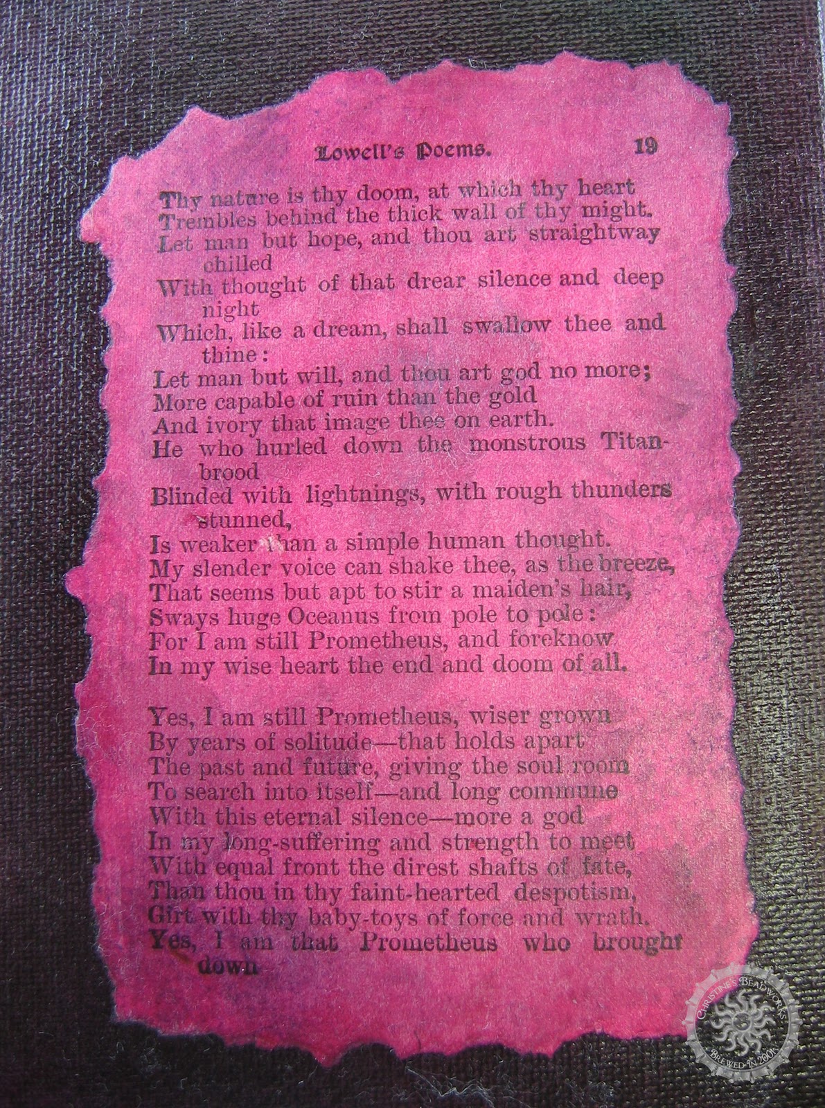
If you read my previous post, one of my goals this year was to reinvigorate my art.  I've invested in a lot of different supplies over the years, but haven't practiced enough to utilize them or the skills I've picked up in classes.  I was quite grateful that Anne, from El Milagro Studios, began posting tutorials and invited us to play along.

I had to break one of my goals, "not to buy any supplies" to get the gloss gel medium, but I felt it was well worth it as I was still using a lot of what I already had.  Anne has directions if you'd like the play along, here I'm just showing you my results and a couple of things I've picked up in the process.

First Lesson Learned

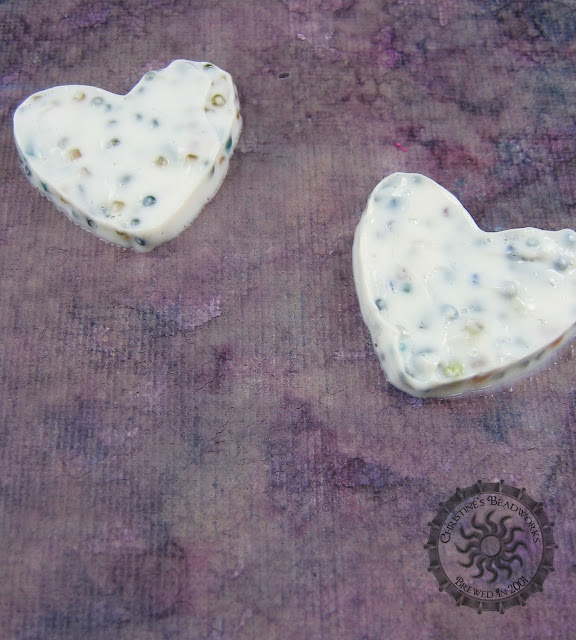
No matter how aggravated you get at your child's mess, don't throw everything away.  I am not a neat person, but even I have my limits.  Unfortunately for my daughter, when I reach my limits, a purge usually follows.  She made valentines from foam hearts when she was about 4 or 5, the kind that you had to punch out of the background foam.  I had saved the left over outline and they would have been the perfect stencil for this project.  Nope, in the last purge not a single piece of foam remained but two of these flowers (you don't know how tempted I was to go the Michael's and buy another bucket of them, $4.99 cheap).  I had a small heart cookie cutter so I was able to make a stencil using Anne's directions.  

 This is what I created following along with Anne using the gel medium and a bin of beads I've collected from leftover projects.  Anne mentioned that her beads bled into the gel.  I've had the problem with resin as well.  There are a couple of types of beads to avoid if you don't want this to happen; color lined and dyed.  I'm sure some others will do the same, but those two I know will cause problems.  My beads are larger than what Anne used and the effect is much lumpier.  In the first heart, I tried to cull out the larger ones; on the second I just let it be.
 This is how it looks after a day of drying.  It still has a lot of drying time left.  The bleeding I'm getting around the edge I think is from the alcohol ink I used on the mat board and not from the beads.  I'm curious to see if the white will disappear completely.  I don't really like a couple of the beads sticking out, but I stopped myself from picking at them....patience.

Second Lesson Learned
You really do need patience to get good results.  I didn't like my background color and squirted diluting liquid all over it and nearly ruined it.  I'm not upset about the near mishap, I could always paint over it, it was wasting a quarter bottle of the liquid...not cheap stuff.  Of course I had to relearn this lesson with the next project.  I didn't let the layers dry completely and nearly ruined my background again....patience (that little white spot in the middle of the page is from the paper coming off on my hands).

 This project involved gluing a sheet of paper to the background.  This time I spray painted the background lightly with black then overcoated it with Pepeo Setacolor transparent paint in Oriental Red with a very wet brush.  I used the same color on a page from an old poetry book I use for a prop in my photos.  I adhered it to the mat board with gloss medium/varnish (yep I had gloss medium but not gel, go figure).  I then lightly tapped on alcohol ink in Slate to tone things down a bit.

Now I had a dilemma, I didn't have any foam left and I didn't want to use the little heart I had cut out earlier, it was so much smaller than the mat board.  
Did I tell you I have a lot of different supplies?  This is a die cut board from my scrapbooking endeavors.  I punched out a few of the shapes and I had a pretty good stencil.  Not as good as the foam, cardboard will not stand up to repeated washing, and it didn't lay as flat so I had to be really careful applying the gel.  This time Anne used German glass glitter.  Crap, I didn't have that so I used some microfine glitter left over from one of Heidi's projects (she's banned from glitter you know).  In hindsight, I probably didn't need this deep of a stencil and could have gotten by with one of my brass stencils (it would be dry by now too, lol).  I'm not sure what the results will be, the glitter may not show up enough since it's so very fine.
I'm pretty proud of my control here, there were a lot of open spaces on that board I had to avoid and a very high risk of seepage under the stencil.  It's not as smooth as I'd like it, but I was afraid to play with it too much.  It would have been easier had I found the quilt basting spray I was looking for (of course I found it AFTER I finished).  It's similar to the light tacky spray you use on stencils to hold them down while you paint.  But, who knows, it may have damaged the background and I did fine without it.  I'll post a follow-up picture when both dry completely (could take awhile, it's pretty thick and it's cold in the house).  I'd used the heat gun, but I'd probably melt the gel....patience.

Check out Anne's blog for instructions and to learn more.

Thursday, February 3, 2011

Winter Wonderland


Winter themes typically involve crystals, glittering snow, ethereal fairies in winter white garb, angels, ice cycles, and children frolicking.  A winter theme involving jewelry will often capture that imagery in spectacular ways and I am looking forward to the responses to Artbead's Winter blogging theme.  

As we leave January and enter February, Michigan's winter often has a harsher look.  The snow is no longer pretty but grimy with dirt, we begin to tire of huddling for warmth, and our arms ache from shoveling mounds of the no longer white stuff out our driveways.  By the end of March, when it is still frosty cold in the Midwest, I will admit to being downright grumpy and feeling more like Robert Brynes, "Winter is Nature's way of say 'Up Yours'.  Should snow fall in April, you'll hear a collective groan from even children who would rather go to school than huddle one more day in the cold.

It was this imagery of winter that captured my imagination.  My husband's yells from the other room as the hockey game played locked in my response to the theme.  I wanted to show winter in an industrial city like Detroit; beautiful but grimy, hard edges and raw power, a raw uncut diamond and a dangerous yet elegant opponent.   

My husband is from the Detroit area and I'll never forget my first Redwings game.  It was before we were married and we went to Joe Louis arena with his parents to watch them on New Year's.  Needless to say, it was an incredible experience.  Nothing beats being at a live game; the pounding of the men hitting the boards, the roar of the crowd, and yes the excitement of the fighting surely chases off the winter chill. 


Hockey, like winter, is many things.  It is beautiful; the shear grace of the players as they maneuver, their unrestrained joy as the puck reaches it's target, the equal joy when a goaltender thwarts a goal, all of it at amazing speed on thin little blades of steel.  It is also brutal, not many players make it through a career with their front teeth intact.

Winter is also breathtakingly gorgeous.  Freshly fallen snow is like a blanket of fine opals while nothing compares to the sun glistening through ice.   And there is no doubt that winter is the harshest of seasons especially to those without adequate heat and shelter. 

Industrial Chic

After a few searches, I selected these items from Artbeads:


I chose the charms as a literal representation of the Redwing's team and the black agate coin beads represent the puck.  From my own stash, I selected stainless steel jump rings to represent the skates.  A hockey sticker and a plumping washer add an industrial element to the back.  A sterling silver washer and sterling wire completes the front of the bezel, effectively invoking the beauty of the season hidden under a layer of patina.  The bottle cap I used originates from Labatt's celebration of Stanley Cup winners.  Usually, I cull the heavily scratch caps from my collection, but these hockey caps are relatively rare and, after all, hockey is a tough sport.  A pristine, unscratched cap would be a bit out of it's element representing what it means to be a Stanley Cup champion.  


The silver bezel was not my first choice.  I've been experimenting with a wire wrap bezel that allows the edge of the bottle cap to show to make it more apparent a bottle cap was used.  However, I still have not captured the right look with wire, it's too delicate and pretty for the more masculine look I wanted.   After two scraped attempts with wire, I found this sterling washing in my stash, left over from a class with Anne Mitchell.   I gently formed the center circle of the washer with pliers, then hammered it to fit the cap.  The rivets holding the layers in place are a combination of aluminum welding rivets and eyelets (where an open area was need for the charms).  

The reverse of the pendant is more industrial looking but still mirrors the front.  The necklace is not quite reversable, (unless you don't mind seeing the hockey player from behind).  I see a lot of potential in these pipe fitting washers from my late step-father's garage.  I believe he would be quite proud that I found a use for them and did not allow them to go to waste.

The chain alternates between the black agate coins wire wrapped with sterling wire and chain maille sections done with square stainless steel jumprings in a Jens Pind pattern.  I love the richness of stainless steel, it is every bit as beautiful as sterling yet tougher.  These rings are 18 gauge, the heaviest I can use with my hand strength and I envy those who work with the heavier gauges.  The Jens Pind pattern is one of my favorites and is a suitable look for men and women alike, and is especially elegant in 20 gauge sterling. 

The clasp is a textured sterling silver magnetic hook and a ring of fine silver I made in a PMC class I took with Kate Mckinnon.  The final piece is not a traditional winter look, but I believe I captured both the feeling of winter in Detroit and the fun of that first hockey game.

As a final note, I selected two additional items from Artbead's; a link that reminded me of an Octopus and a another that reminded me of a goalie mask.  They didn't make it into the design, but I believe I'll purchase another set to use as earrings.  So for now, I'll keep them a surprise. 


You can learn more about the products used in this project at Artbeads (the product codes are included in the picture) and find charms here and semi-precious stones here.


Disclosure: The above mentioned beads from Artbead.com were kindly provided free-of-charge by Artbeads.com, within the frames of Artbeads.com blogging program. The author of this blog has not received any payment from above-mentioned company. The post above represents only personal opinion of the blog author.  You can find additional participating artists and their blogs on Artbeads' facebook page.